Improving PatchWall's User Experience
- Jan 26, 2023
- 3 min read
Updated: Feb 5, 2023
PatchWall's major USP is it's content recommendations from across platforms. This project looks at improving UX and making the interface a content first interface.

PatchWall is a content aggregator product for Xiaomi TV & Redmi TVs. It's a product that is known for it's content recommendations across various OTTs/live channels. Content is curated everyday on the product by PatchWall's curation team.
It is important to study the current version of the product and understand the journeys and product features that work and that don’t work. I believe that this is the first step to start the design process.
What we found after the product study as well as from a quantitative research was that users mostly use PatchWall to explore content and help them choose a specific content to watch in their time.
Journey of content discovery on PatchWall

Design and how users perceive what they see
Eric Jenson, in his book 'Brain Based Learning' talks about how our brain can capture images that our eyes see for as little as 13 milliseconds (10 times faster than a wink). This means that we are evolved to absorb information at an absurd speed. Further more, a study showed that
90% of everything that comes to mind is triggered by visual stimuli
65% of the population are considered to be Visual Learners and would consider studying and engaging with information when linked to visual elements
Keeping the best interest of the product in mind, it is also important to see how much effect of cognitive load it has on its users. Cognitive Load imposed by a user interface is the amount of mental resources that is required to operate the system. Though Smart TV is a casual usage device, users still have to learn to use TV interface's navigation, layouts and functional forms of the system. Even when the interface is familiar, user still has to carry around the information relevant to their goal. For example, when planning to watch an Action movie, a user cognitive load includes the interface related knowledge and specific movie filters that they may have (Subscriptions, time duration, actors etc).
Design with Ease
With the PatchWall 3.0 version, it was very import to focus on minimising the cognitive load of its users and yet keeping the design functionality in place.
Few key factors I kept in mind during the design process:
Avoid Visual Clutter The product being a content aggregator already has many different posters to display. It was important to refrain from adding meaningless visual elements, color changing gradients, multiple typography elements, etc across the product so as to not impair usability.
Build on existing Mental Models People already have mental models on how Smart TV/OTT interfaces work, based on their past experiences with other products. When you use labels, headers, layouts that they might have encountered on other products, you reduce the amount of learning they have to do on your interface.
Offload Tasks Look for and list out anything in the design that requires users to read text, remember information or make a decision and look for alternatives: maybe show an image, re-display previously clicked information. By doing so, every task the design eliminates, the more mental resources you leave the user with for decisions that are truly essential.
For the new design, I was focused on reducing cognitive load of the PatchWall's users by avoiding visual clutter, building on existing mental models and offloading tasks.
PatchWall 3.0: What's working and What isn't?
(Insert PatchWall 3.0 designs)

Low-fidelity Wireframes
I believe that an idea has to be tested before being designed, while being designed and after being designed. Longterm plans are expensive & inefficient most of the time and by doing so, we learn about the improvement possibilities only after all of it is developed. In the process, we get the feedback too late and if we fail, all of the effort and time is lost… That is why, quick prototypes are preferred.

High-fidelity Designs
A high-fidelity design is an interactive representation of the product in its closest look & feel
to the final design in terms of details and functionality. We increase the detail level from low to high, following our knowledge about the product & functionality we are building. I believe that if we encounter any technical/functional difficulties in the process, we do not loose time in development as we only spend time for necessary details needed to give context.
Details Page

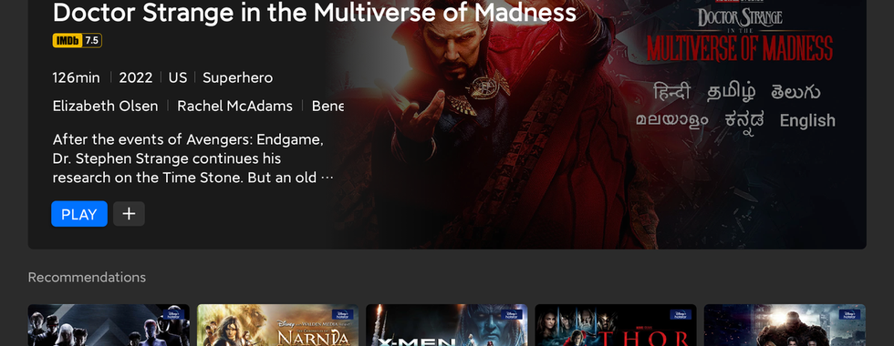


Click '>' to see the old version
Home Page


Click '>' to see the old version
Kids Mode


Click '>' to see the old version
Universal Search


Click '>' to see the old version

