How UX helped Xiaomi in increasing Brand Recall?
- Jan 7, 2023
- 4 min read
Updated: Jan 13, 2023
Steps taken by Xiaomi's product: PatchWall to increase their brand-recall value amongst it's users
What is brand recall and why is it important? Brand recall is the probability of someone remembering your brand, it's products and it's services with aided or unaided questions. It's not just about recognising the brand by it's logo but also associating the brand when thinking about a segment/service.
Strong brand strategies are built keeping in mind how each of these - Brand Recognition, Brand Experience and Brand Recall play a role in increasing the brand value amongst it's users. The better the experience is of the brand's products, the better will be the Brand Recognition and better the Brand Recognition, the better will be it's Brand Recall value amongst users.

What were the pain-points for PatchWall?
When I came onboard the PatchWall team, I found out that a latest Xiaomi TV's marketing survey report clearly suggested that users of PatchWall were unable to recognise PatchWall as a Xiaomi service with both aided and un-adided survey questions. This was a major drawback for the product since their was no mention of the brand/logo within it's product experience.
This lead us as a team to think on how we would tackle this issue. PatchWall is used as a KSP for selling Xiaomi and Redmi TVs so it was crucial to find good solutions to this problem of non informed users. Design along with product team got to brainstorming ideas to improve branding within the product to help better the brand recognition and recall.
What did PatchWall do to tackle this?
Following are 1st iterations of my various ideas and implementations that would help in re-enforcing the brand name within the product experience: My suggestions included adding PatchWall logo placements on the landing page as well as introducing/incorporating the name PatchWall in various rows and collection names.
Ideas of adding PatchWall logo or incorporating the word PatchWall across various product features and screens


I presented the ideas to the various stakeholders of PatchWall across business, marketing, product and product evangelists within the organisation to gain their insights, understanding and feedbacks which would feed back into the design process.
Once all the stakeholders were on board with the direction, the main aim of the project was clear. To introduce branding elements across various touch points within the product. This is to add clear branding which the users can relate to.
Design Process:
The design process started out with identifying the main screens and features of the product which would have a greater impact with the addition of the branding element.
For example: PatchWall has been marketing Universal Search feature for over 3+ years but there is not a single screen in the product which states/calls out 'Universal Search'. Similarly, Universal Search within Kids Mode feature shows only child-friendly content results. This quality of Universal search is not specified in the Mode.
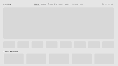
Home Screen:
Understanding the current user journey for the Tabs and Notification row:
Until version PatchWall 3, the Tabs and Notification bar used to be placed in two different levels. This was to help user navigate to the 1st icon on notification row with just one click on the remote.
It was important to understand how important and frequent did the users navigate to the notification row and also understand the priority of the icons on the notification row as well. I relied on a data-driven approach known as the Failure Modes Affect Analysis (FMEA) to inform my process and list usability priorities for the users.
Occurrence x Severity x Detection = Risk Priority Number
Accounting for frequency and severity are two important ingredients when communicating about a usability problem. In this case, I did an analysis of:
How users use the PatchWall home page (specifically concentrating on the tabs on the tab row and the notification row icons). This would suggest which of these specific actions are very important to the users.
How frequently do they access icons on notifications row (search, UserCentre, Kids Mode, wifi & settings)
Compiled the results from 1 & 2 with clicks and impressions data from the analytics team. (These numbers cannot be displayed in the table below)

Wire-framing the Solution:
The above process really helped understand how the users operate the current version of the product and to identify the key important placements of certain tabs to feed this data into my design process. I worked on addressing the findings and coming up with potential solutions for our logo placement:
Position of tabs and icons
Reducing the number of steps for frequently accessed items
Establishing a clean and clear visual hierarchy
Come up with standardised styling, color and UI for the product
I quickly designed a few wireframes to gather feedbacks from Product, engineers, and users on the overall layout and structure of the page.


Validating the designs: I conducted a usability testing sessions with the primary users of the product to validate weather the new visual hierarchy, overall placement is clear and also to validate the readability of the new text size on the device.
These sessions revealed how less arduous it was for the user to understand the new design. They were quickly able to understand that this was PatchWall's screen and could navigate through the tabs and navigation bar easily without any intervention.
High-fidelity mockups:
Taking the feedbacks and results from the test of the low fidelity designs, I went on the improve the design and create the high-fidelity mockups.
Tab Switching: (Video)
Main Design:

Developing the designs:
I worked very closely with the development teams to map out any missing interactions which were not covered in the high fidelity mockups. I worked closely with both testing and development teams to conduct a UX review of every front-end development that was implemented to ensure that it was aligned with the designs before it went live.
Results and Key takeaways:
Since the implementation and roll out of the new design, a in-person user research was conducted and it was observed that:
The users easily identified what product they were using
The product association amongst user was significantly high
Top of the mind recall value increased from 23% to 45%.

